Webflow for SaaS Landing Pages: 2026 Guide
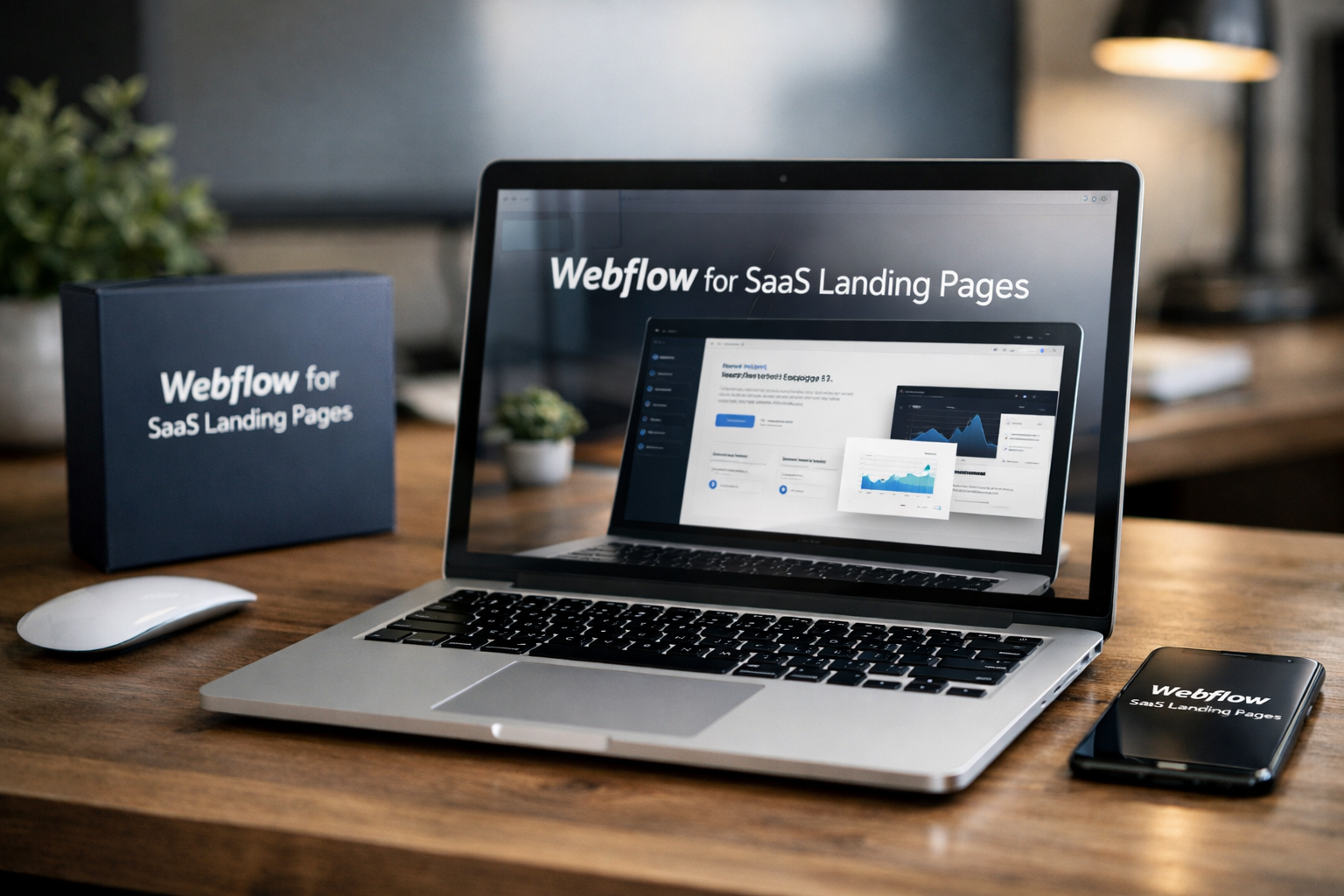
For SaaS teams, a landing page is rarely just a website page. It is the destination for product launches, paid campaigns, waitlists, demo requests, pricing research, and partner referrals. The best webflow landing pages make the offer clear quickly, build confidence, and give visitors one obvious next step.
In 2026, founders and growth teams need speed without settling for generic-looking pages. Webflow is worth considering when you want polished visual control, a practical builder workflow, and access to an established ecosystem of templates, cloneables, and landing page examples. It is not the only startup landing page builder, but it can be an especially strong option for teams that see design and messaging as conversion tools rather than decoration.
Official website · Latest pricing & offers
What Makes Webflow a Strong Choice for SaaS Landing Pages in 2026?
Webflow appeals to SaaS teams because it sits between a simple drag-and-drop site tool and a fully custom development project. It gives marketers and designers meaningful control over page layout, hierarchy, and visual presentation while helping reduce the number of small marketing-page changes routed through engineering.
For a new SaaS product, that matters. A landing page often needs to change after customer interviews, campaign tests, or a repositioning decision. Teams using webflow landing pages can make those updates more directly instead of waiting for a full product sprint.
Why startups use Webflow for fast launch cycles
Startups often need multiple pages around the same product: a main homepage, a waitlist page, a feature-specific campaign page, a comparison page, and a demo-booking page. Building every variation from scratch is slow, while relying on one rigid template can make every campaign look identical.
Webflow provides a middle ground. A small team can create reusable page sections, then adapt the copy, proof, offer, and CTA for different audiences. For example, an AI accounting startup might use one base design for a founder-focused waitlist page and another for a finance-team demo page.
The key advantage is not simply publishing quickly. It is being able to test new positioning quickly while maintaining a credible brand experience.
How Webflow supports conversion-focused design
A strong SaaS page directs attention in a deliberate order: value proposition, problem, proof, product understanding, and action. The visual flexibility of a webflow landing page builder is useful because conversion design depends on details such as content hierarchy, contrast, spacing, section flow, and CTA visibility.
In practical reviews of landing pages, I consistently find that clean structure beats visual excess. A page should help a visitor answer five questions:
- What does this product do?
- Who is it for?
- Why is it better than the current alternative?
- Can I trust it?
- What should I do next?
Webflow gives teams room to answer those questions in a design that feels specific to the product rather than forced into a generic software layout.
Where Webflow fits in the SaaS funnel
Webflow landing pages work well across the awareness and consideration stages of a SaaS funnel. At the top of the funnel, use a focused page for an ad campaign, lead magnet, webinar, or product announcement. In the middle, use feature, use-case, integration, or comparison pages to help prospects evaluate fit.
Near conversion, a page can support demo requests, free-trial exploration, sales contact, or waitlist registration. The right CTA depends on purchase complexity. A self-serve product may prioritize “Start free,” while a higher-ticket B2B platform usually benefits from “Book a demo” paired with qualification-focused messaging.
Webflow Landing Pages vs. Other Builders for SaaS
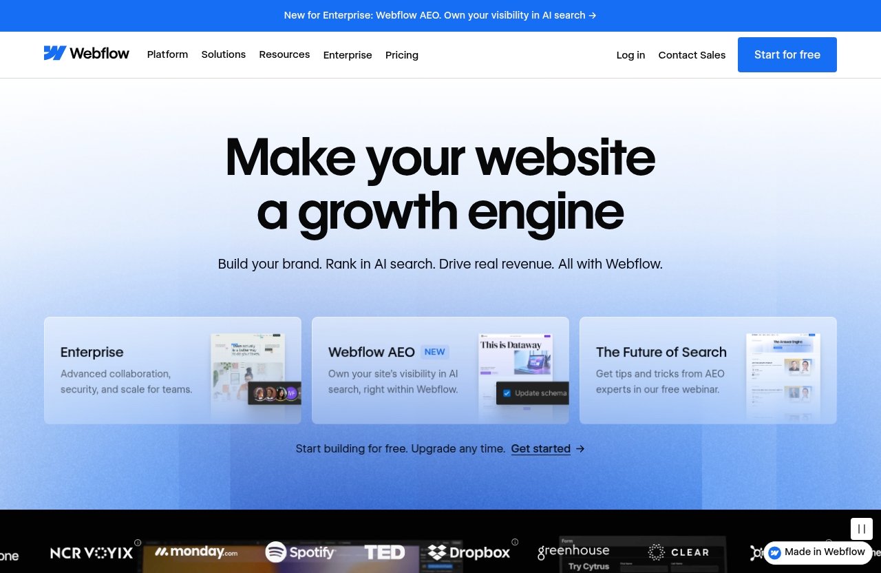
The best platform depends on your team’s workflow, design standards, campaign volume, and technical needs. No builder automatically creates high converting landing pages; the message, offer, traffic quality, and follow-up process still determine results.
That said, webflow landing pages are particularly appealing for teams that want visual customization without treating every campaign page as a developer project.
Webflow vs. Framer for speed and design control
Framer is often considered by teams that value fast visual creation and modern design workflows. It can be a sensible choice for simple, highly visual launch pages, especially when the team wants to move from a design concept to a published page quickly.
Webflow may be the better fit when a startup expects to build a broader collection of structured marketing pages and wants a familiar ecosystem around templates, cloneables, and reusable page patterns. The choice is less about declaring one tool “better” and more about identifying how much control, repeatability, and page evolution your marketing operation requires.
Webflow vs. Wix for SaaS-specific flexibility
Wix can be approachable for businesses that need a straightforward web presence and prefer an all-in-one website-building experience. For a local business, portfolio, or early validation page, that simplicity can be enough.
For more tailored SaaS landing page design, Webflow is often more attractive to teams that care deeply about layout precision, brand differentiation, and campaign-specific page architecture. If your product needs multiple customer segments, use cases, or messaging angles, flexibility becomes more valuable than initial simplicity.
For another website-builder perspective, see our comparison of [Webflow vs Dorik: Which Website Builder Is Better in 2026?](/webflow-vs-dorik).
When Webflow is the better long-term choice
Webflow is a strong longer-term choice when marketing will regularly launch, learn, and refine. It suits teams that expect their site to become a library of product pages, customer stories, resources, use cases, and conversion paths rather than a static five-page brochure.
It may be less suitable if you only need a single bare-bones page and do not care about design flexibility, or if your campaign requires highly specialized custom application logic. In those cases, a simpler builder or a custom development approach may be more efficient.
Pricing and value considerations
Value should be judged by more than the monthly platform cost. Consider the time saved on developer requests, the cost of slow campaign launches, and the potential impact of clearer positioning and stronger conversion paths.
PRODUCT FACTS: Official pricing details were not accessible in the provided source, so verify current plans and prices directly on Webflow before buying.
If the design workflow and template ecosystem fit your team, you can explore Webflow through this affiliate link and review the current options directly. Treat the final purchase decision as a workflow decision, not just a price comparison.
The Best SaaS Landing Page Structure in Webflow
A good page structure reduces cognitive load. Visitors should not have to hunt for the core benefit, work out who the product serves, or guess how to take the next step.
The most effective webflow landing pages usually use a focused narrative rather than an endless stack of disconnected sections. Each block should move the visitor closer to understanding and action.
Hero section that communicates value fast
The hero section should communicate the outcome, audience, and next action in a few seconds. Avoid vague claims such as “The future of work” unless the supporting line makes the product immediately understandable.
A practical hero formula is:
| Element | Purpose | SaaS Example |
|---|---|---|
| Headline | State the primary outcome | “Close monthly books in days, not weeks” |
| Subheadline | Explain who it helps and how | “Automated workflows for scaling finance teams” |
| Primary CTA | Present one clear action | “Book a demo” |
| Visual | Make the product or result tangible | Dashboard, workflow, or before-and-after view |
| Proof cue | Reduce early skepticism | Customer logo, rating, or user count when substantiated |
For webflow landing pages, keep the first screen focused. A visitor should not face three equal-priority buttons, a crowded navigation bar, and a paragraph-long mission statement before understanding the offer.
Problem-agitation-proof solution sections
After the hero, explain the costly status quo. This is where you show you understand the visitor’s actual friction: manual reporting, slow approvals, fragmented data, missed leads, or hard-to-maintain processes.
Then demonstrate the solution with specific product outcomes. “Save time” is weak on its own; “Turn weekly pipeline updates into an automated summary for sales leaders” is more concrete. Use short product visuals, concise explanations, and outcome-led headings.
The proof element matters. It can be a customer quote, a measurable result you can substantiate, a recognizable integration, or a clear product walkthrough. Claims should be credible and tied to the real buyer problem.
Social proof, feature blocks, and trust elements
Trust sections should answer the concern that naturally follows interest: “Will this work for a company like mine?” Useful proof includes relevant customer stories, role-specific testimonials, security or compliance information where applicable, and transparent product visuals.
Feature blocks work best when they explain benefits, not just labels. Rather than listing “Automated reporting,” explain the business value: “Give every stakeholder a current view of performance without manual spreadsheet updates.”
When reviewing webflow landing pages, I look for proof close to key decision points. A testimonial beside a demo CTA can be more useful than a wall of logos placed far below the section that makes the promise.
CTA placement and lead capture strategy
A CTA should appear after meaningful points of persuasion, not only at the top and bottom of the page. Repeat the same primary action at logical intervals, especially after the hero, proof section, and final offer summary.
Keep forms proportional to the value exchange. A newsletter signup can require an email address. A demo request may reasonably ask for role, company, and business need, but excessive fields reduce completion rates. If you need stronger nurture after lead capture, connect the process to a suitable email platform; our guide to [email marketing tools like Systeme.io](/email-marketing-tools-like-systeme-io) can help with that wider workflow.
How to Launch Faster with Webflow Templates and Cloneables
Starting from a proven layout is one of the fastest ways to shorten launch time. The Webflow ecosystem includes webflow landing page templates, Made in Webflow examples, and community-created starting points that give teams a practical foundation.
Templates do not replace strategy. They remove repetitive layout work so the team can focus on positioning, proof, and the offer.
Choosing a landing page template
Choose a template based on the sales motion, not just the visual style. A product-led SaaS company may need a concise page with product screenshots and a trial CTA. A sales-led B2B platform may need more space for use cases, proof, objections, and demo conversion.
Evaluate webflow templates against these questions:
- Does the layout match your primary CTA?
- Does it have enough room for product proof and customer evidence?
- Is the mobile experience clean and readable?
- Can sections be removed without making the page feel incomplete?
- Does the design suit your brand personality?
For broader guidance, review our roundup of [Webflow templates for small businesses in 2026](/webflow-templates). Even though SaaS needs differ from local-business needs, the evaluation principles—clarity, flexibility, and maintainability—remain useful.
When to start from a cloneable instead of a blank canvas
Webflow cloneables can be useful when you want a proven section, interaction pattern, or layout structure without beginning with a completely empty project. They are especially helpful for early-stage teams that have a clear offer but limited design resources.
A cloneable is not automatically production-ready. Check its responsiveness, remove unnecessary elements, review typography, and ensure the layout supports your own message. Searching for webflow templates free or webflow landing pages free can uncover useful starting points, but free does not always mean strategically suitable.
Start from a blank canvas when the product is unusual, the brand has an established design system, or the buyer journey needs a genuinely custom narrative. The goal is faster clarity, not faster imitation.
How to customize without breaking design consistency
Before changing colors and sections, define a simple design system: brand colors, type scale, spacing rhythm, button styles, card treatment, and image rules. This prevents the common startup problem of a page that looks like several templates combined.
Customize in this order:
- Rewrite the core message and CTA.
- Replace generic imagery with product-specific visuals.
- Add relevant customer proof.
- Remove irrelevant sections.
- Align colors, typography, and spacing with your brand.
- Test every key screen size before publishing.
This approach turns webflow landing pages into differentiated assets rather than template-shaped pages with swapped logos.
Official website · Latest pricing & offers
Conversion Optimization Checklist for SaaS Landing Pages
Conversion optimization is not a one-time redesign. It is a disciplined process of reducing uncertainty and friction. Before sending paid traffic to a new page, review the basics below.
Headline and subheadline testing
Test the message before testing minor design changes. A better headline usually has more impact than changing a button color or decorative illustration.
Try contrasting a product-category headline with an outcome-led headline. For example, “AI Sales Forecasting Software” may be less persuasive than “Forecast Pipeline Risk Before Your Quarter Slips.” Keep the subheadline specific enough to explain the mechanism and intended user.
CTA wording and button placement
CTA wording should reflect commitment level. “Get started” can work for a familiar self-serve product, while “See how it works” may feel lower-risk for a new category. For enterprise buyers, “Talk to an expert” can be more natural than pushing an immediate trial.
Use one dominant CTA per page. Secondary links are acceptable when they help hesitant visitors, such as “Watch the 90-second overview,” but they should not compete visually with the primary conversion action.
Forms, demos, and waitlist capture
Every form field creates friction. Ask only for information you will use in the next step. If sales qualification is essential, explain why the form exists and set clear expectations about what happens after submission.
For waitlists, reinforce the benefit of joining: early access, priority onboarding, launch updates, or exclusive product feedback opportunities. Avoid promising benefits you cannot deliver.
Mobile-first review and page speed basics
Many visitors will first encounter your campaign from a mobile device. Review pages on a real phone, not only a desktop preview. Check that headlines remain readable, buttons are easy to tap, forms do not feel intrusive, and screenshots still communicate the product.
Before publishing webflow landing pages, remove unnecessary autoplay media, oversized visuals, distracting animations, and sections that do not advance the decision. Fast comprehension is as important as technical speed.
Recommended Webflow Workflow for Small Startup Teams
The best workflow keeps strategy ahead of design and design ahead of unnecessary production work. A founder, marketer, and designer can collaborate effectively when each stage has a clear owner and review point.
Wireframe the offer before building
Start with a one-page messaging brief. Define the target buyer, their biggest pain point, the promised outcome, top objections, proof available, and the one primary CTA.
Then turn that brief into a low-fidelity wireframe. This can be a simple document or sketch with section names and rough copy. Doing this before opening the builder avoids expensive visual iteration around an unclear message.
Build the page in sections
Build reusable blocks for the hero, logos, product overview, feature-benefit sections, testimonials, FAQ, and final CTA. Section-based work makes later testing less disruptive because you can replace one block without rebuilding the page.
For campaign teams, this makes webflow landing pages easier to scale. A core page framework can support different personas, industries, and paid-ad messages while preserving visual consistency.
Hand off edits to marketing without bottlenecks
Agree on clear editing boundaries. For instance, marketing can update copy, approved visuals, and campaign sections, while a designer maintains core components and brand rules. This prevents accidental visual drift while keeping everyday updates fast.
Create a lightweight publishing checklist: copy reviewed, CTA links tested, form confirmation checked, mobile reviewed, analytics verified, and stakeholders approved. Small teams move faster when launch quality is repeatable.
Iterate based on analytics and feedback
Use both quantitative and qualitative signals. Look at conversion rate, CTA engagement, form abandonment, scroll behavior, sales-call feedback, and questions repeatedly raised by prospects.
Do not change five major things at once. Form a hypothesis—such as “buyers do not understand the use case above the fold”—make one meaningful revision, and compare results over a sensible traffic period. The strongest webflow landing pages improve through this steady learning cycle.
Common Mistakes to Avoid on Webflow SaaS Landing Pages
Good tools cannot compensate for weak page strategy. The most common conversion problems are usually about clarity, hierarchy, and buyer confidence—not a lack of animations or visual polish.
Too many sections or competing CTAs
A long page is not inherently bad, especially for complex B2B software. But every section needs a job. If a block repeats information, introduces a new audience, or distracts from the primary action, remove or rethink it.
Likewise, avoid asking visitors to start a trial, book a demo, download a guide, join a community, and contact sales all at once. Decide what conversion matters most for that page.
Weak above-the-fold messaging
The first screen should not make visitors decode your business. Abstract taglines, generic “all-in-one” claims, and insider language create immediate friction.
A stronger approach names the audience and outcome. This is the single most important fix for many underperforming webflow landing pages because it improves relevance before the visitor has invested much attention.
Overdesigned pages that slow down decisions
A sophisticated visual style can support credibility, but design should clarify rather than compete. Excessive motion, oversized gradients, tiny type, hidden navigation, and decorative copy can make a SaaS product appear less trustworthy.
Use design to guide attention toward the message, product evidence, and CTA. If an effect does not improve understanding, it is probably optional.
Using templates without tailoring to the offer
A template is a starting point, not a conversion strategy. Generic feature cards, filler testimonials, and unrelated sections signal that the page was assembled rather than designed for the buyer.
Replace every generic component with product-specific language and proof. Study landing page examples for structural inspiration, but make the final page reflect your category, customer, and conversion goal.
Is Webflow Worth It for Your SaaS Landing Page?
For the right team, Webflow is worth serious consideration. It is especially useful when the company needs fast campaign execution, stronger visual differentiation, and a marketing site that can evolve as positioning matures.
The best webflow landing pages are not necessarily the most elaborate. They are the ones that make a relevant promise, demonstrate the product clearly, reduce risk with evidence, and make the next step easy.
Best-fit use cases
Webflow is a strong fit for:
- Startups launching a new SaaS product or waitlist
- Growth teams running paid acquisition campaigns
- B2B companies driving demo requests
- Product-led SaaS brands improving trial conversion pages
- Small teams that need polished pages without constant engineering involvement
- Companies that want to adapt templates and cloneables into a consistent website system
It is particularly compelling if your landing page must look more considered than the standard output of a basic startup landing page builder.
Who should consider another builder
Consider another option if your priority is the absolute simplest possible one-page launch with minimal customization. A lighter tool may be faster for a temporary validation page where brand polish and page iteration are not important.
You may also need a different approach when the page depends on deeply custom logic, unusual product functionality, or development workflows that must be tightly integrated with an existing application stack. Webflow can support a strong marketing presence, but it should not be forced into solving every technical requirement.
A simple decision framework
Choose Webflow if you can answer “yes” to most of these questions:
| Decision question | If yes, Webflow may fit |
|---|---|
| Do we need polished pages quickly? | Visual control supports faster campaign launches. |
| Will marketing update pages regularly? | A flexible workflow can reduce engineering dependency. |
| Do we need more than one page or audience angle? | Reusable sections and templates support scale. |
| Does brand quality affect buyer trust? | Tailored design can strengthen perceived credibility. |
| Can we invest time in messaging and customization? | The strongest results come from intentional page strategy. |
My practical verdict: Webflow is a strong choice for founders and small SaaS teams that value speed, design quality, and ongoing flexibility. Review current pricing directly, assess a few webflow landing page templates against your funnel, and explore Webflow through the affiliate link if its workflow matches how your team plans to launch and optimize.
Official website · Latest pricing & offers
FAQ
Is Webflow Good for Landing Pages?
Yes. Webflow is well suited to landing pages for teams that want visual design control, fast publishing, and access to templates, cloneables, and conversion-oriented layouts. It is most valuable when you plan to refine pages over time rather than publish one static page and leave it unchanged.
Can I Build a SaaS Landing Page in Webflow Without Coding?
Many teams can build and publish a SaaS landing page visually without coding. However, advanced interactions, unusual integrations, or custom logic may require additional setup or technical support.
What Should a SaaS Landing Page Include?
Include a concise hero section, benefit-led messaging, product visuals, relevant social proof, feature highlights tied to outcomes, clear CTAs, and a short demo, trial, or waitlist flow. The exact structure should match the buyer’s awareness level and your sales motion.
Are Webflow Templates Good for Startups?
Yes, provided you customize them thoroughly. Webflow templates can reduce launch time and give startups a reliable structure, but the copy, product visuals, proof, and CTA strategy must be tailored to the actual offer.
How Do I Improve Conversions on a Webflow Landing Page?
Start with a clearer headline, a more specific value proposition, and one dominant CTA. Then reduce form friction, add relevant customer proof, make product benefits easier to understand, and review the full experience on mobile before testing further changes.
Related Reading
References
- Landing Page Website Templates – Webflow
- Best Landing Page Websites | Free Examples & Designs – Webflow
- Page building: Landing page builder made easy | Webflow
- 26 best landing page examples that drive conversions – Webflow